
Gone is the Nationals (Natinals?) logo in block letters with gold trim, which I really liked but apparently nobody else did. Gone also is the interlocking "DC," which was widely adored here in the District. The Nats said they want to put more emphasis on the curly W. I'm honestly not sure why.* The curly W is nice but having it on the hat is enough--it doesn't need to be on everything.
*Newsflash for the Lerners and other Nats higher-ups: we know you're not from around here, but we don't call our home Washington; we call it DC, or the District. The letter W has no inherent meaning to us, not like the letters D and C.
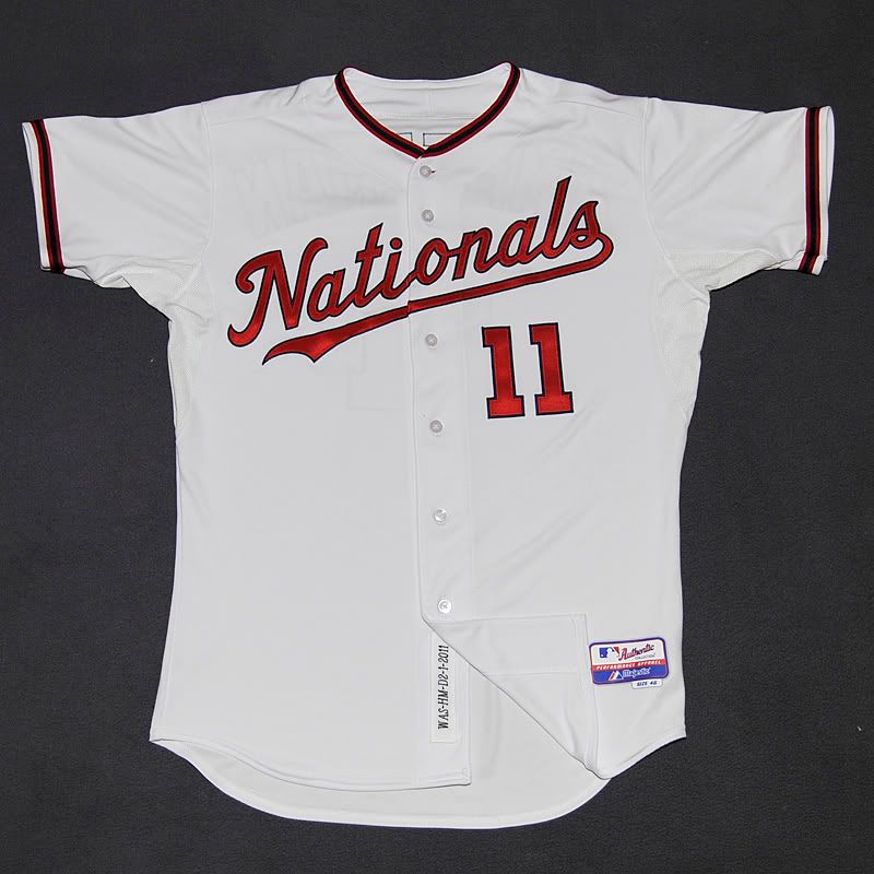
Here's a closer look at the away uniform, the patriotic alternate, and the red alternate:

As you see, no interlocking DC and piping everywhere. I think it's the piping that bothers me most: far too reminiscent of a batting practice jersey. Can't say I'm a fan of the location of the number on the front, either. Seems like the W should be breast-right and the number torso-left so that it reads top-left to bottom-right.
But the biggest disappointment isn't what they did, it's what they didn't. Sturgeon General sent me this photo, a supposed prototype that the Nats won't be using:
This looks perfect to me: it's simple, classy, and retro. Retro is far more important for the Nats than you'd think, since you see them constantly trying to construct a history that they don't have (they've entirely eschewed their French-Canadian origins and lay claim to the histories of the last two iterations of the Senators/Nationals). This would have played into it perfectly.
Unfortunately, a misguided attempt to grow the brand has resulted--in my opinion--in the less appealing design.
(Photo Credit: WaPo DC Sports Bog)
3 comments:
The drop of the DC in favor of the curly W leads me to ask this question: Exactly what brand are they trying to grow?
I don't know about others, but when I look at that W, I definitely see a distinct brand identity. Unfortunately it is probably not the one they are trying to promote. I see Walgreens.
Take a look:
http://musing-minds.com/wp-content/uploads/2010/08/sab-washington.jpg
Yes, that is an unfortunate similarity. Obviously it harkens back to the Senators logo, but I really don't know why we'd want to remember them.
True, but if they are really trying to draw upon Washington's long (but often unsuccessful) baseball history, then maybe they should do their homework better. The 2nd Washington franchise wore the Curly W for 9 years. For most of the history of Washington baseball they wore stuff more like this:
http://www.fansedge.com/Washington-Senators-Cooperstown-59FIFTY-Fitted-Hat-_1216916787_PD.html?gproductads=46-28707
Heck if you go to the Nats website it even shows their hats over the years and from 1916 to 1960 it was plain W's.
http://shop.mlb.com/family/index.jsp?categoryId=1169016
Being that the teams from that era also used the Nationals moniker, had all time great players such as Walter Johnson and actually won a World Series, that is the franchise they should be trying to evoke comparisons to, not the Rangers.
Post a Comment